Art & Architecture
 |
 |
 |
 |
 |
 |
 |
The Cathedral of Orvieto – I
Should the Gothic Cathedral Be Painted?
Anyone who admires gothic monuments enjoys seeing not only the general lines of the buildings and their elegance, but also the actual stone of those enduring edifices. In general the stone is gray or beige, of a somewhat undefined color, enormous strong masses that appear to gush from the earth like the jet stream of a rough-hewn fountain bursting to the surface stones from pre-historic times. Thus, we have cathedrals, castles and towers that emerge from the ground and impress all who appreciate the fruits of the Middle Ages.
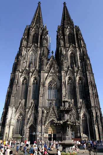
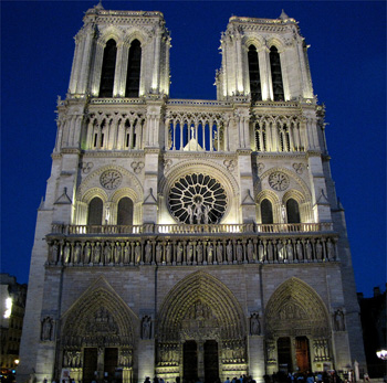 The gray-beige stone has not a defined color, but with its own particular beauty. Someone might ask himself whether the cathedrals could have had another type of beauty. Admitting this to be possible, he could ask if the cathedrals would be more beautiful if they were painted.
I have heard more than once persons who are fanatics of what they call “gothic purism” affirm: “Never, to paint them would be a blasphemy! They should be as they are, in stone, and any other option would make them lose their distinctive characteristics.”
I agree that the raw stone in its present day color is fitting for the buildings and reflects a form of beauty that I admire, and I would be very sorry should they disappear. But, to say that this is the only possible beauty and label the possibility they could be painted as blasphemy contradicts the historic reality.
Indeed, well-researched studies have demonstrated that the statues in Notre Dame of Paris and other gothic monuments were painted. Only the wear of time and the elements made them lose their brilliant colors. The people did not demand their restoration because it was they who had decayed; they had lost the admiration for the gothic. However, for many of those statues and sculptures it was still possible to restore the paintings to their original condition.
Now then, if those men who conceived those gothic marvels originally painted them, it is somewhat hasty to declare it is a blasphemy not to leave them in their present state of neutral stone.
Not so long ago, during the reformation work on the cellars of a bank in Paris, some excavations were made and they found a collection of the heads from the statues of kings that originally were in Notre Dame Cathedral. When the bandits of the French Revolution in their hatred for all kings beheaded them, a counter-revolutionary took those stone heads and buried them deep in the ground. He died and no one knew that he had done this. More than 200 years later, unexpectedly those heads were found. On them one can see remains of paint of many different colors.
Thus, we should admit that the cathedrals could have been painted; that colored cathedrals are consistent with the gothic style. This is true not only for cathedrals but also for other gothic monuments such as city halls, and also for castles insofar as they were not fortresses but private residences. For example, inside of the enclosure of the castle, the chapel and the residence of the feudal lord could have been painted.
In principle, souls who admire the harmony of ensembles ask: If the form is so beautiful, why should we not add color to ornament this form? I believe that form and color should not be dissociated.
The gray is beautiful, first, because of the rude and battling aspect of the stone; second, because the gray invites to think of any color. When we see a gray cathedral, our subconscious vaguely and successively presents to us various colors for it. This is one of the charms of the gray.
It is beautiful to see a stone cathedral bearing on its somber walls the shining light of stained glass windows. It is beautiful to see those precious stones embedded in a rude wall. But it is more natural for a precious stone not to be inlaid in raw stone. It is natural that they shine on a wall that is also colored.
In this sense, I found the Cathedral of Orvieto, which is one of the most beautiful gothic buildings that I know, quite illustrative.
 I invite you to analyze with me some photos.
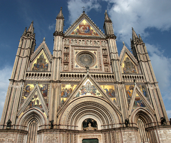
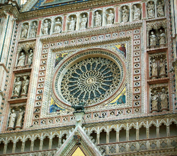
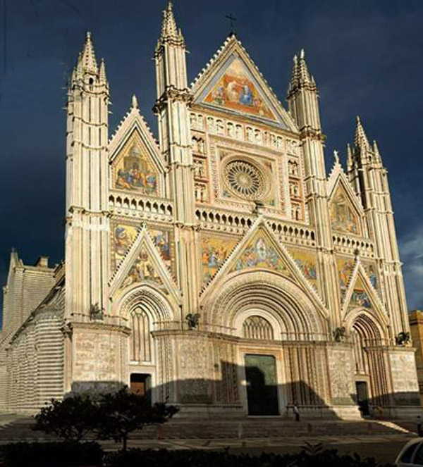
You are seeing a fairylike display of colors in this façade, which is strictly gothic. The only thing that is not precisely gothic is the square frame around the rosette window over the central arch. The square has something of classical architecture, but it fits perfectly here.
The background color is gold, the most splendorous color. The whole façade is painted over a golden background. The façade is completely coated with mosaics of such a quality that it gives the impression that work on the Cathedral ended only yesterday, although it is a building that was completed in the 16th century.
In this sense, it does not present the poetry of raw stone, which becomes more beautiful as it grows old. By defying time and the elements, the old stone acquires its beauty. We would say that this building in Ovieto only knew summers and springtime. The winters and tragedies of History slipped over it, without touching it.
The stone speaks of eternity insofar as it resists time and affirms its existence against it. Time goes by, the stone remains. The mosaics of Orvieto somehow touch on eternity by ignoring time. It does not really resist time because it has nothing to do with it; time does not touch this edifice. The mosaic is there, that is it; the cathedral is there, that is it.
For a grander and more living chromatic impression, there are various groupings of mosaics that report events from the life of Our Lady, starting at the triangular top arch that represents her coronation in Heaven. At the right and left of the rosette are other groups of figures. Continuing down to the top of the doors, inside or outside the arches we find other mosaic figures. Color is everywhere.
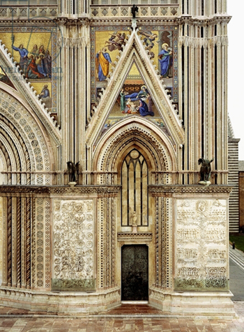 Although the colors are very lively, they are not shocking. They have the beauty of defined colors, each one with its own individuality. In each group there is a special symphony of colors. Please, note the beauty of the distribution of the colors over the lines of the ensemble of the gothic architecture.
Here in Orvieto you see a superb expression of what the synthesis, the harmony between form and color can be.
There is an old dispute between artists: What is more splendorous, form or color? What is more remarkable in a picture, the design or the color?
There are two Italian schools that differ in this regard: the Florentine School, entirely turned toward design, intentionally weak in color in order to emphasize the design; the Venetian School, magnificent in color, using the design only as a pretext to display the colors.
Here in the Cathedral of Orvieto you have a splendid synthesis of the two schools.
Continued


The massive somber stone on the Cathedral of Cologne, above, and Notre Dame in Paris, below

I have heard more than once persons who are fanatics of what they call “gothic purism” affirm: “Never, to paint them would be a blasphemy! They should be as they are, in stone, and any other option would make them lose their distinctive characteristics.”
I agree that the raw stone in its present day color is fitting for the buildings and reflects a form of beauty that I admire, and I would be very sorry should they disappear. But, to say that this is the only possible beauty and label the possibility they could be painted as blasphemy contradicts the historic reality.
Indeed, well-researched studies have demonstrated that the statues in Notre Dame of Paris and other gothic monuments were painted. Only the wear of time and the elements made them lose their brilliant colors. The people did not demand their restoration because it was they who had decayed; they had lost the admiration for the gothic. However, for many of those statues and sculptures it was still possible to restore the paintings to their original condition.
Now then, if those men who conceived those gothic marvels originally painted them, it is somewhat hasty to declare it is a blasphemy not to leave them in their present state of neutral stone.
Not so long ago, during the reformation work on the cellars of a bank in Paris, some excavations were made and they found a collection of the heads from the statues of kings that originally were in Notre Dame Cathedral. When the bandits of the French Revolution in their hatred for all kings beheaded them, a counter-revolutionary took those stone heads and buried them deep in the ground. He died and no one knew that he had done this. More than 200 years later, unexpectedly those heads were found. On them one can see remains of paint of many different colors.
Thus, we should admit that the cathedrals could have been painted; that colored cathedrals are consistent with the gothic style. This is true not only for cathedrals but also for other gothic monuments such as city halls, and also for castles insofar as they were not fortresses but private residences. For example, inside of the enclosure of the castle, the chapel and the residence of the feudal lord could have been painted.
In principle, souls who admire the harmony of ensembles ask: If the form is so beautiful, why should we not add color to ornament this form? I believe that form and color should not be dissociated.
The gray is beautiful, first, because of the rude and battling aspect of the stone; second, because the gray invites to think of any color. When we see a gray cathedral, our subconscious vaguely and successively presents to us various colors for it. This is one of the charms of the gray.
It is beautiful to see a stone cathedral bearing on its somber walls the shining light of stained glass windows. It is beautiful to see those precious stones embedded in a rude wall. But it is more natural for a precious stone not to be inlaid in raw stone. It is natural that they shine on a wall that is also colored.
In this sense, I found the Cathedral of Orvieto, which is one of the most beautiful gothic buildings that I know, quite illustrative.

Gothic enhanced by colorful mosaics in Orvieto Cathedral; below, the square frame of the rose window does not clash with the whole

You are seeing a fairylike display of colors in this façade, which is strictly gothic. The only thing that is not precisely gothic is the square frame around the rosette window over the central arch. The square has something of classical architecture, but it fits perfectly here.
The background color is gold, the most splendorous color. The whole façade is painted over a golden background. The façade is completely coated with mosaics of such a quality that it gives the impression that work on the Cathedral ended only yesterday, although it is a building that was completed in the 16th century.
In this sense, it does not present the poetry of raw stone, which becomes more beautiful as it grows old. By defying time and the elements, the old stone acquires its beauty. We would say that this building in Ovieto only knew summers and springtime. The winters and tragedies of History slipped over it, without touching it.
The stone speaks of eternity insofar as it resists time and affirms its existence against it. Time goes by, the stone remains. The mosaics of Orvieto somehow touch on eternity by ignoring time. It does not really resist time because it has nothing to do with it; time does not touch this edifice. The mosaic is there, that is it; the cathedral is there, that is it.
For a grander and more living chromatic impression, there are various groupings of mosaics that report events from the life of Our Lady, starting at the triangular top arch that represents her coronation in Heaven. At the right and left of the rosette are other groups of figures. Continuing down to the top of the doors, inside or outside the arches we find other mosaic figures. Color is everywhere.

Scenes from the life of Our Lady in mosaic grouping decorate the façade from from top to bottom
Here in Orvieto you see a superb expression of what the synthesis, the harmony between form and color can be.
There is an old dispute between artists: What is more splendorous, form or color? What is more remarkable in a picture, the design or the color?
There are two Italian schools that differ in this regard: the Florentine School, entirely turned toward design, intentionally weak in color in order to emphasize the design; the Venetian School, magnificent in color, using the design only as a pretext to display the colors.
Here in the Cathedral of Orvieto you have a splendid synthesis of the two schools.
Continued

A splendid synthesis of form and color

Posted October 19, 2015
______________________
______________________


