Social-Political Issues
 |
 |
 |
 |
 |
 |
 |
The Liverpool People’s Cathedral
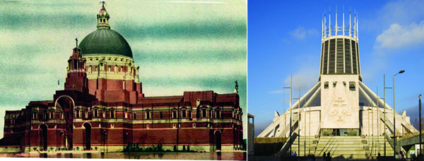
At left, original cathedral design; at right, final building adopted shortly after Vatican II
Catholicity, historicity & architecture
Part of the Catholic Church’s appeal has always been her timelessness – she has the unique position in History as the sole foundation of Jesus Christ’s Kingdom on earth. This timelessness is transmitted through tradition, not only in the spiritual sphere but also in the temporal. Thus, the transcendent and sacral art, literature and architecture came, naturally blossoming in Christendom from this tradition rooted in Our Lord.
The Church has always communicated this sense of tradition particularly through her architecture, which is considered the most complete art since it encompasses all the others. Though it has passed through many different artistic periods throughout History, architecture has always retained certain traditional aspects in its structures. We can point out three of them: solemnity, hierarchy and beauty.
With regard to solemnity, a traditional church’s architecture was framed in a way that emphasized seriousness and reverence. The focal point was the altar with the tabernacle, and elements like the columns, ornaments, candles and stained glass windows would encourage this reverence, thus elevating the mind and senses of man to the glory of God in the church.
With regard to hierarchy, a traditional church was always founded on a certain sense of order. This order was found not only in its exterior architecture, but its interior design as well. It reflected a clear sense of inequality within the church, distinguishing the priest from the layman, the layman from the saint on the window, and even the saint on the window from the choirboy.
With regard to beauty, architects used color, light and texture to enliven the mind and bring it to a deeper contemplation of the beauty of God. Tapestries, stained glass, buttresses, mosaics and iconography communicated the richness that flowed from Catholic tradition.
What we see in the above two pictures is a stark contrast: at left, a dignified church founded on tradition, and, at right, a cacophonous conciliar church that follows modern conventions.
A grand colossus
The original model for the Liverpool Cathedral – which is what you see at right – possesses all three of the traditional aspects: solemnity, hierarchy, beauty.
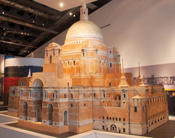
Original cathedral design by Sir Edward Lutyens
Commissioned in 1930, this original model was the work of the famed architect Sir Edward Lutyens. This grand colossus would have been the second-largest church in the world, with the largest dome and also the largest organ. The idea was to tower over all of the other Protestant temples, particularly the Liverpool Anglican Cathedral, which was being built around the same time and just down the street. The model was to be a Catholic response to this Protestant monstrosity, and would have dwarfed it in comparison, boasting 520 feet in height vs. a smaller 331 feet building in the Anglican Cathedral.
Then, in the year 1960 the plan was scrapped, the model put in a closet. Financial impossibility was used as an excuse, opting for simplicity over traditional grandeur. Replacing it was the new monstrosity designed by Sir Frederick Gibberd, which can hardly be called a church, let alone Catholic.
The cathedral’s website itself claims that the change in architectural plans was because the church needed to “express the new spirit of the liturgy then being radically reformulated by the Second Vatican Council”.
The countdown commences: an architectural space oddity
To the Catholic of the 1960s, it would have been a shock.
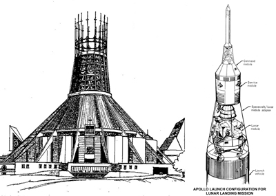
The new Cathedral looks like a spaceship - here compared to the diagram of Apollo 13
Now, what impressions does the interior suggest?
What first comes to our attention is that everyone is meant to be on the same level, since the pews and the altar are placed without a significant difference of height. This shows a progressivist conception of the Mass, according to which the Mass is not turned toward God, but toward the people, which is the clear egalitarian and Protestant “people of God” idea that the Conciliar Church has beaten people over the head with since Vatican II ad nauseam.

At left, interior of Liverpoool Cathedral; center, European Union Parliament; right, Palace of Peace in Astana, Kazakhstan
There is no solemnity; since the people are the center of the church, the grandeur of God has no place and consequently there is an invitation to irreverence.
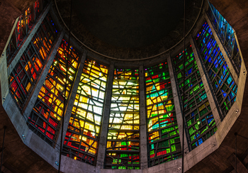
Chaotically arranged pieces of stained glass insinuate an occult message
Besides the comparison with the EU parliament and the Palace of Peace, the interior of the church could pass quite well for a Wiccan temple (below right).
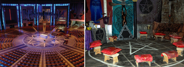
The center star on the floor in the Liverpool Cathedral resembles that of a Wiccan temple in Edinburgh
It would take some time, but soon the people began to accept the new architecture and doctrine that was behind it: that it was a “people’s cathedral” built in “the spirit of a new age”, not a church made foremost for the honor and glory of God.
One suspects that this is what the architects of the new Liverpool Cathedral had in mind – to turn the Catholic world upside down.

Posted July 19, 2017
______________________
______________________
 Volume I |
 Volume II |
 Volume III |
 Volume IV |
 Volume V |
 Volume VI |
 Volume VII |
 Volume VIII |
 Volume IX |
 Volume X |
 Volume XI |
 Special Edition |


